Vitesse Cycling Club
www.facebook.com/VitesseCyclingThe goal of this project was to redesign the road cycling kit for Vitesse, an established competitive cycling team based in Eastern Pennsylvania. The design aimed to build on the team's existing brand identity while modernizing their kit to reflect both their legacy and the evolving aesthetics of the sport. The new kit focuses on minimalism and modern design, with a nod to the sleek lines and bold color contrasts that have defined the most iconic pro team kits of the past decade.
Objective
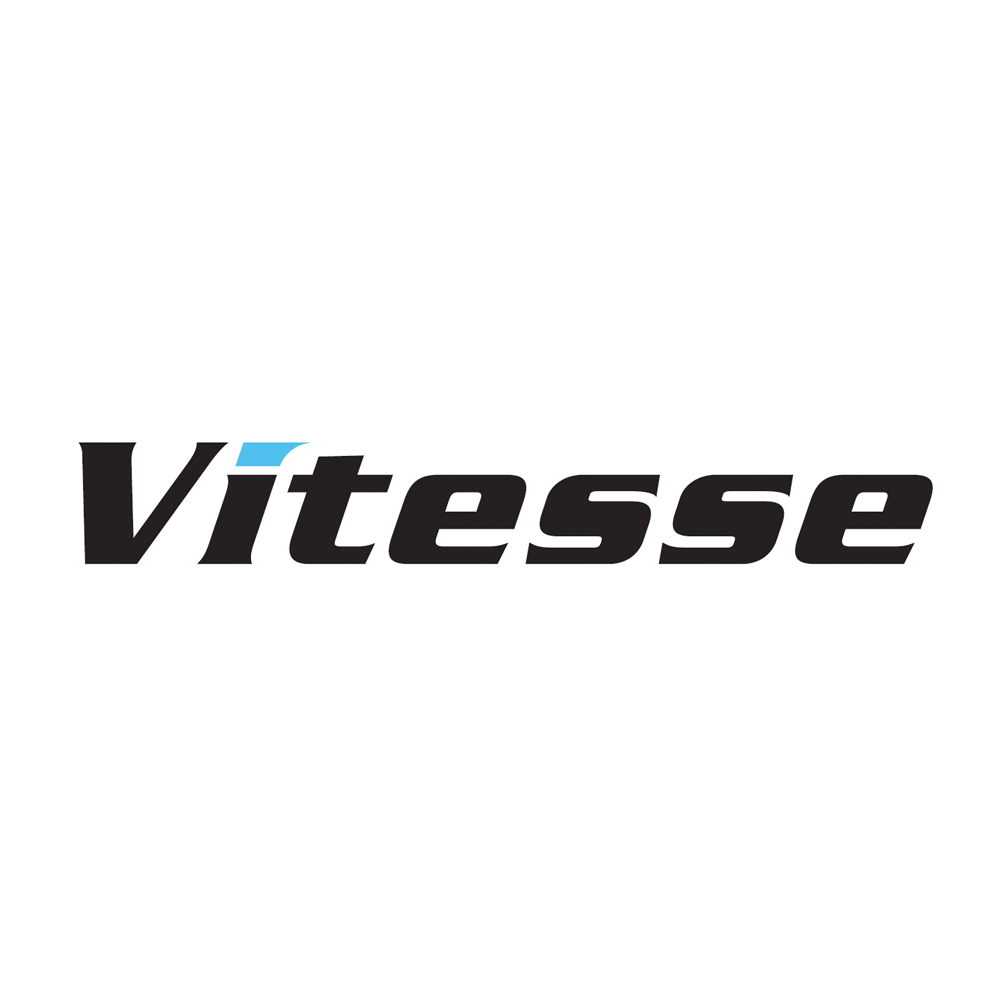
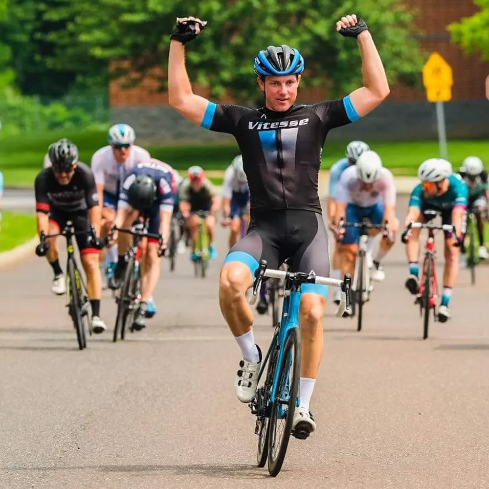
- Retain Brand Identity: Use of the team's existing logo and color palette (cyan blue, black, and white) to maintain recognition and consistency across the brand.
- Modern and Professional Aesthetic: Creating a design that feels both contemporary and dynamic, appealing to both the team's athletes and their competitive level.
- Increase Visibility and Presence: Enhance the team's visibility during races through a bold design that creates an unmistakable presence on the course.
Design Approach
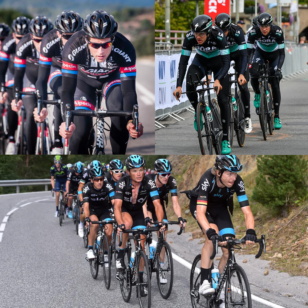
The design process began with an analysis of the team's history and its competitive environment. Vitesse's previous kits had focused on bold simplicity, primarily using black with occasional accent colors. The new kit needed to reflect this design legacy while moving towards a more modern, high-performance aesthetic. We also studied successful pro cycling kits from the past decade. Teams such as Team Sky, Giant-Alpecin, and Bora-Hansgrohe have employed clean, streamlined designs with geometric shapes, often featuring strong contrasts of color and sleek lines. These teams have successfully married tradition with innovation, balancing sponsor visibility with team identity.
Design Elements
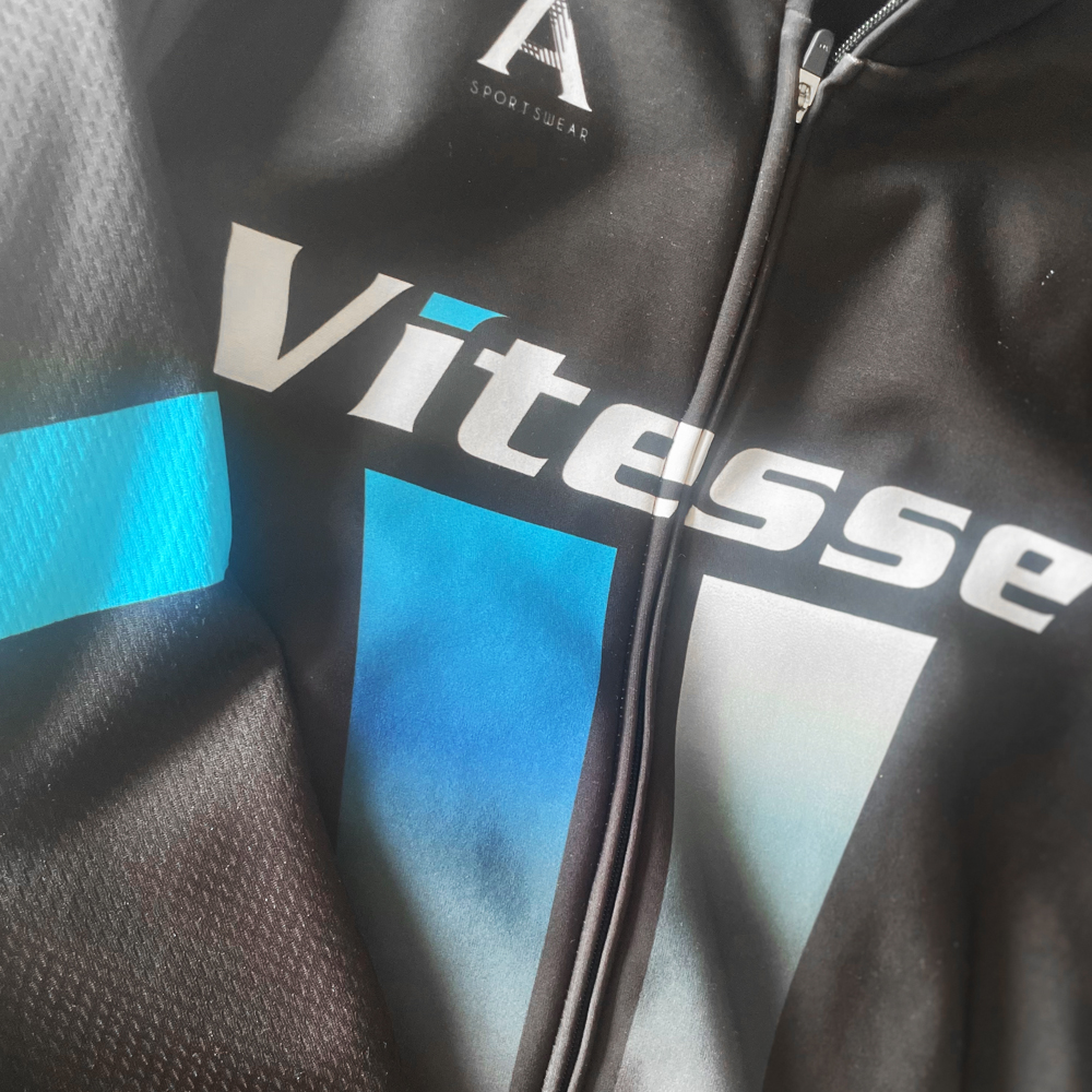
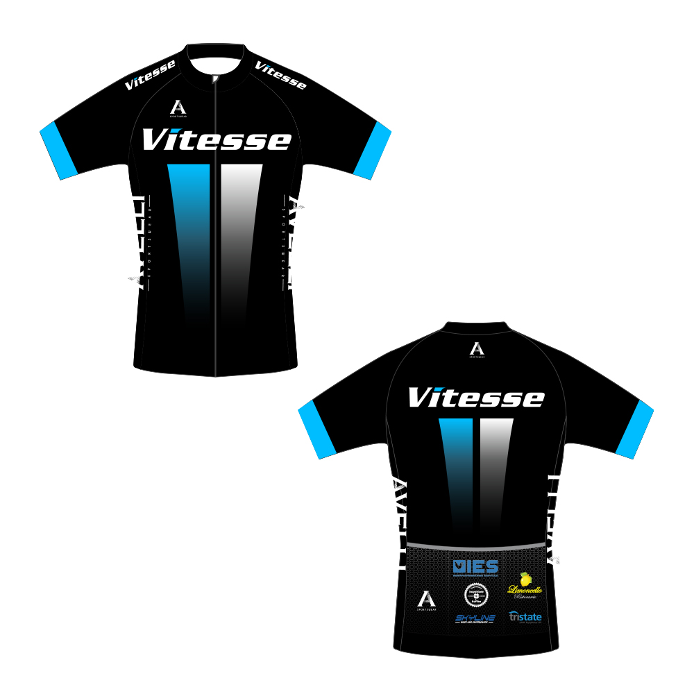
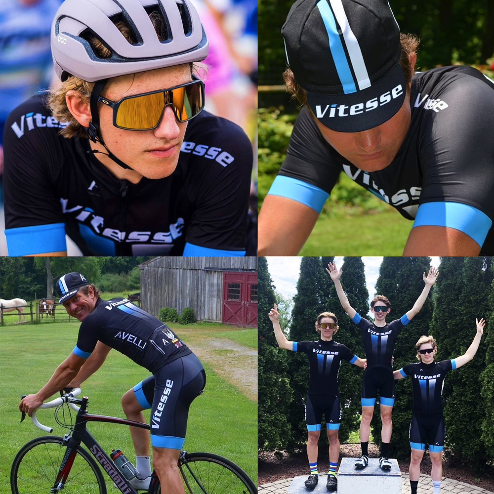
- Front and Back Linear Shapes: The design features dynamic, linear shapes running vertically down the front and back of the jersey. These lines create a sense of motion, reflecting the speed and precision of cycling. The lines are subtle yet impactful, offering a sense of elegance and structure while avoiding over-complication.
- Team Logo Placement: The Vitesse logo is prominently featured on the chest, back and shoulders, with careful attention given to scale and position to ensure maximum visibility without overpowering the overall design.
- Contrast and Balance: The black background allows the cyan blue and white accents to pop, creating visual interest and a sense of depth. The linear shapes break up the solid black sections, making the design feel less flat and more dynamic.
- Minimalist Sleeve Design: The sleeves are black with subtle cyan blue bands, a reference to the classic pro kit aesthetic. The simplicity of the sleeve design complements the boldness of the body's lines.
Color Palette
- Cyan Blue: Use of Vitesse's existing team colors, providing a pop of brightness and energy.
- Black: Dominates the kit, providing a sleek, professional, and timeless look.
- White: Used for accents and to enhance legibility and contrast, particularly on logos and text.
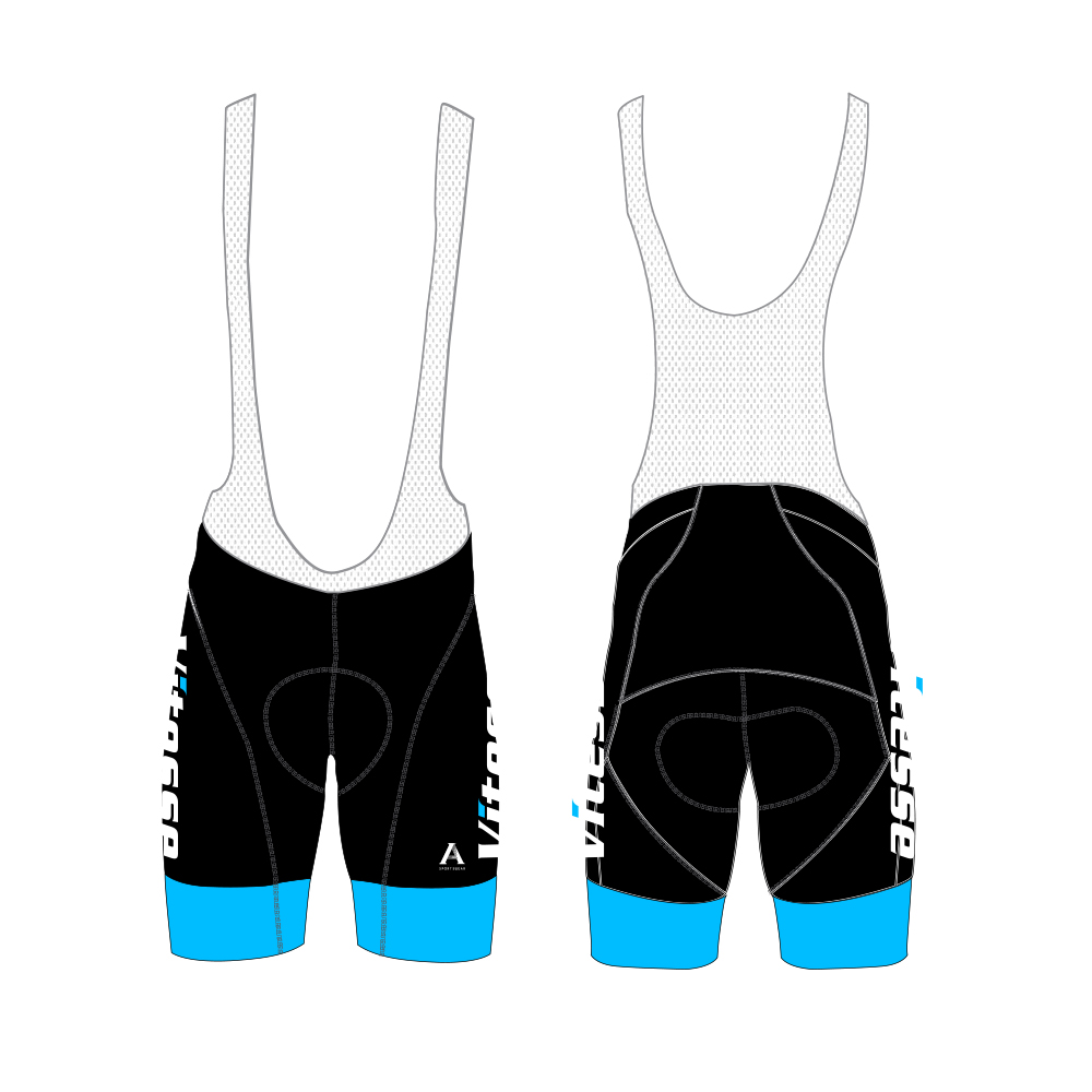
The bib-shorts take on the same basic design pattern with the team logo large and prominent down the leg and again the blue bands completing the kit.
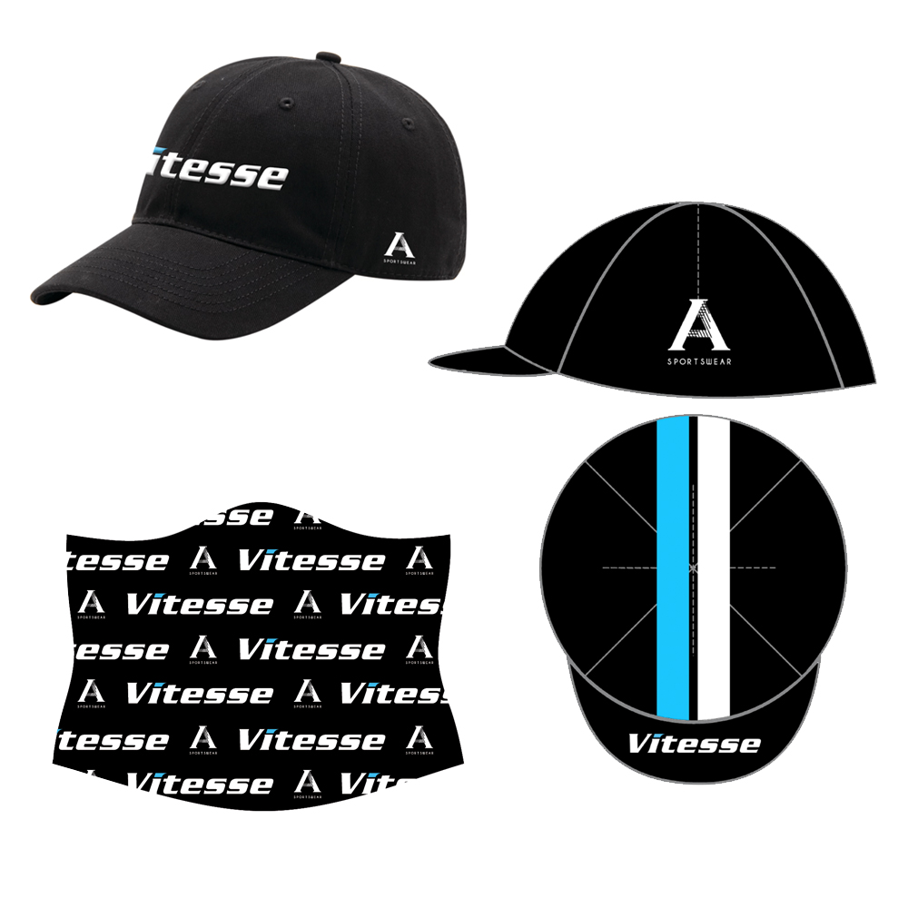
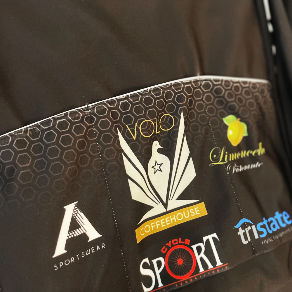
Accessory Designs
Cycling kit accessories like cycling and podium caps, cold weather accessories, and team casual wear requires a combination of functionality, style, and brand identity. Each of these items serves a unique purpose while enhancing the rider's experience, whether on or off the bike. Each item must reflect the brand or team's identity, whether through logos, color schemes, or specific design motifs. The design is cohesive with the team's racing kit while allowing for some flexibility in style for off-the-bike apparel.
Outcome
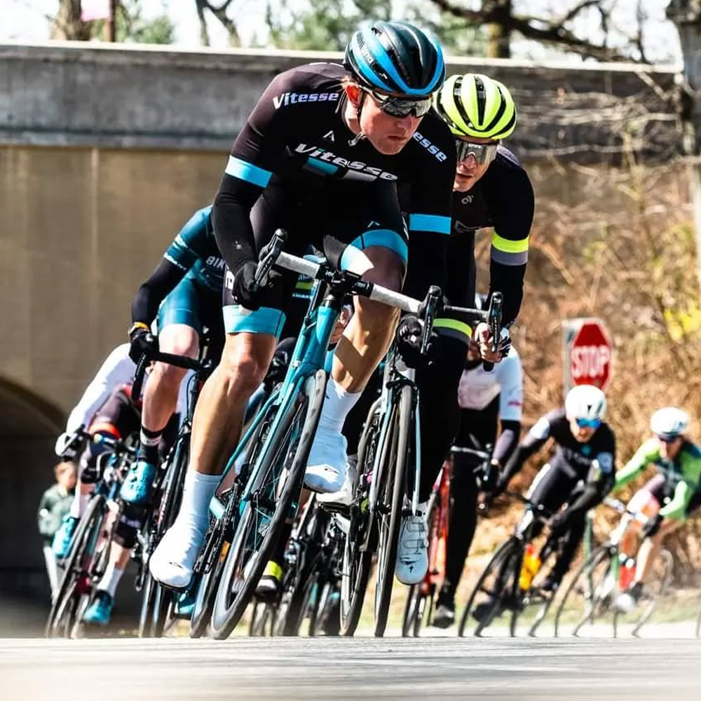
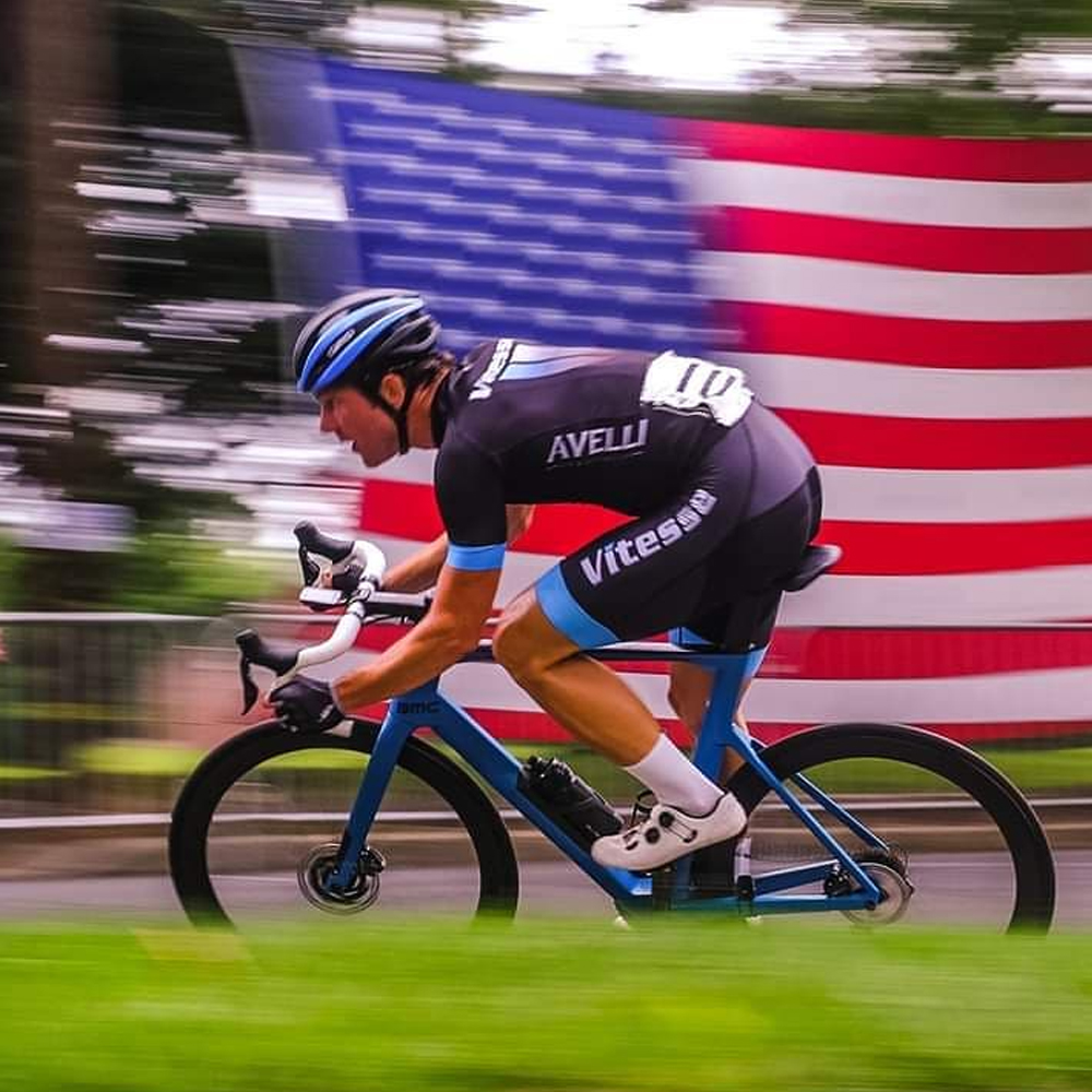
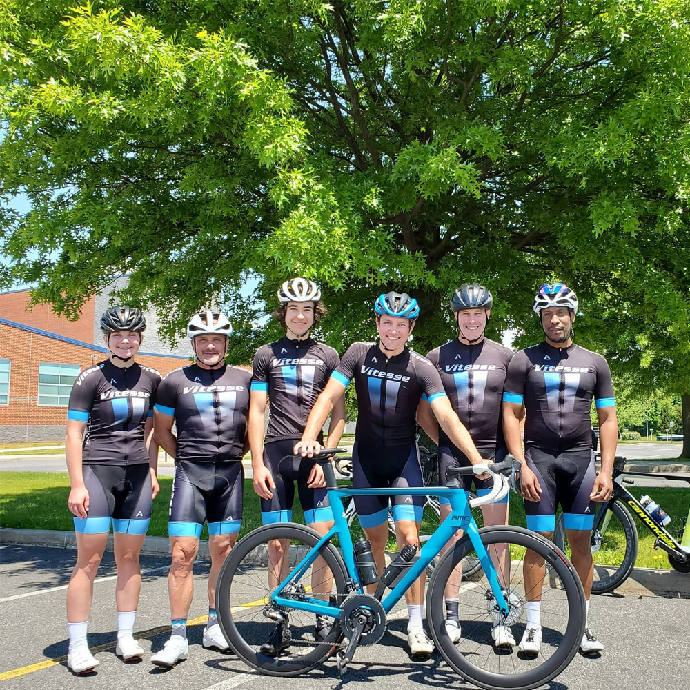
The redesigned Vitesse cycling kit successfully combines style and performance, creating a bold yet elegant look that resonates with both the local cycling community and the wider amateur/professional cycling scene. The streamlined design, with its modern linear shapes and carefully selected color palette, presents a fresh update to an already established team.
Brand Recognition: The design elevates Vitesse's presence within the local competitive cycling scene, making the team more recognizable at events. The team's logo is showcased clearly, while the clean and bold aesthetic makes a statement.
Enhanced Team Spirit: The athletes wearing the new kit report feeling a strong sense of unity and pride. The design symbolizes the team's ambition and professional growth, reinforcing their competitive edge and commitment to excellence.
Local Impact: The design resonates strongly with the local community. By blending elements of classic pro kits with a unique twist, Vitesse stands out as a team that honors tradition while looking forward to the future.
Conclusion
The redesign of the Vitesse cycling kit is an effective balance of aesthetic innovation and brand consistency. The minimalist yet modern design captures the essence of the team's spirit, enhancing their visibility and solidifying their position as a force to be reckoned with in the local competitive scene. The kit has not only given Vitesse a refreshed look but also reaffirmed their commitment to amateur/semi-professional cycling, offering a perfect blend of form, function, and identity.
More Client Case Studies