Coupe
Coupe is a custom automotive modification design company that specializes in bespoke interior and exterior enhancements.
Catering to a wide range of vehicles from economy models to luxury, as well as classic and late-model vehicles... Coupe's mission is to elevate the day-to-day user and driver experience.
This case study details the process behind creating a logo that reflects the company's ethos of quality, sophistication, and personalization.
Branding Objective
- Elegance and Simplicity: The logo must convey a sense of sophistication while remaining clean and versatile.
- Timeless Appeal: Reflecting Coupe's ability to work with both classic and modern vehicles, the logo must transcend fleeting design trends.
- Focus on User Experience: The design should communicate a user-centered approach, resonating with customers seeking personalized automotive enhancements.
- Versatility: The logo needs to be adaptable for use across diverse mediums, including vehicle badges, business cards, decals, and merchandise.
Concept Development
The design process began with research into automotive customization branding trends, typography styles, and customer perceptions.
Key inspirations included:
- Typography with fluid, script-like qualities to evoke a personal touch and craftsmanship.
- Single color treatment aligning with the brand's elegance and simplicity.
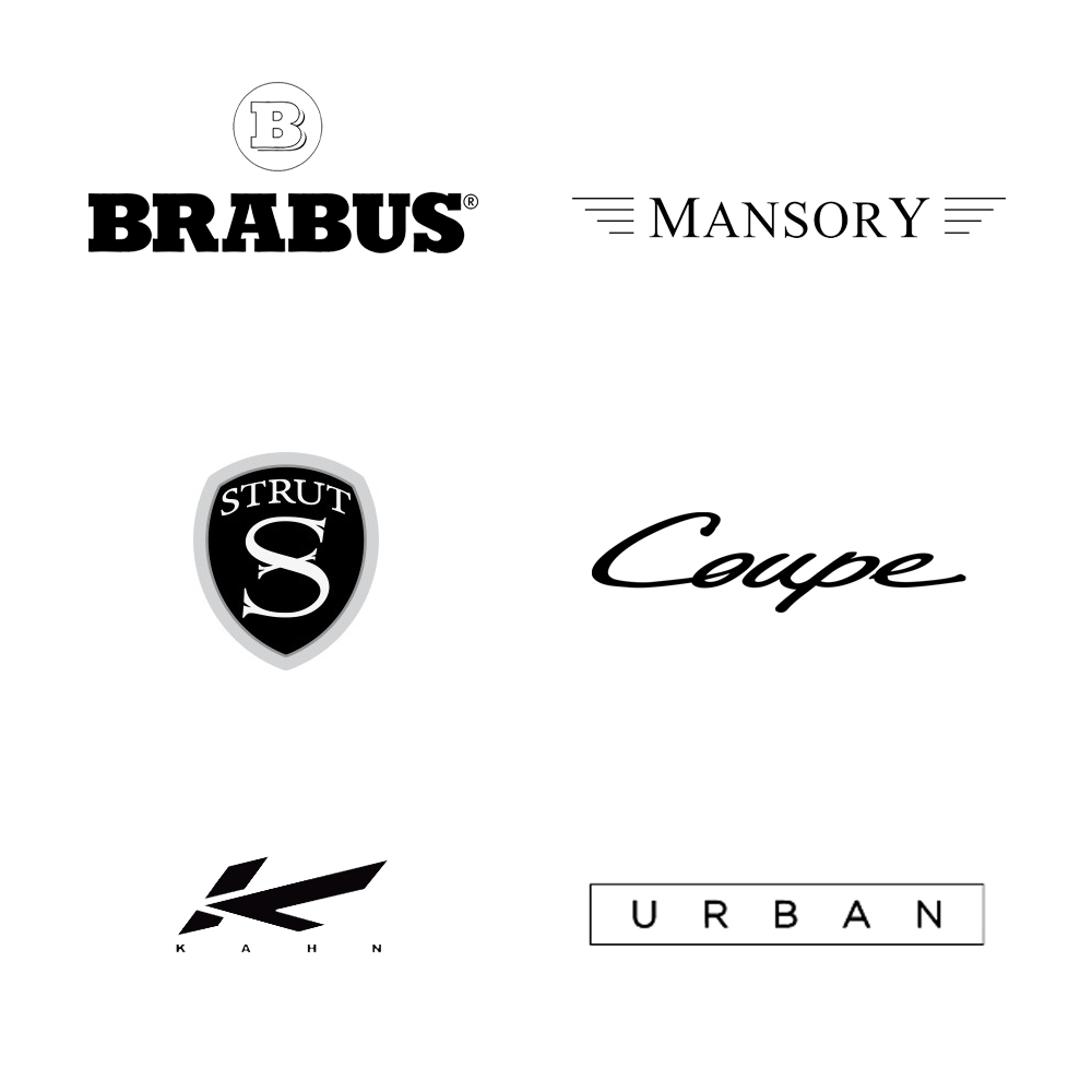
- Well known players in the automotive customization space.
- Modern minimalism to appeal to contemporary tastes.
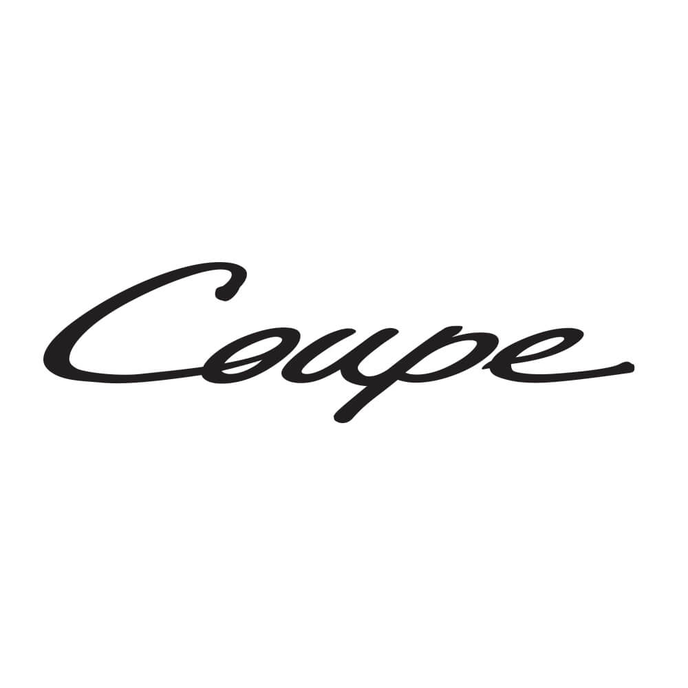
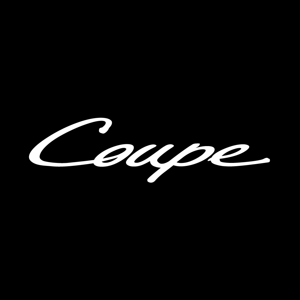
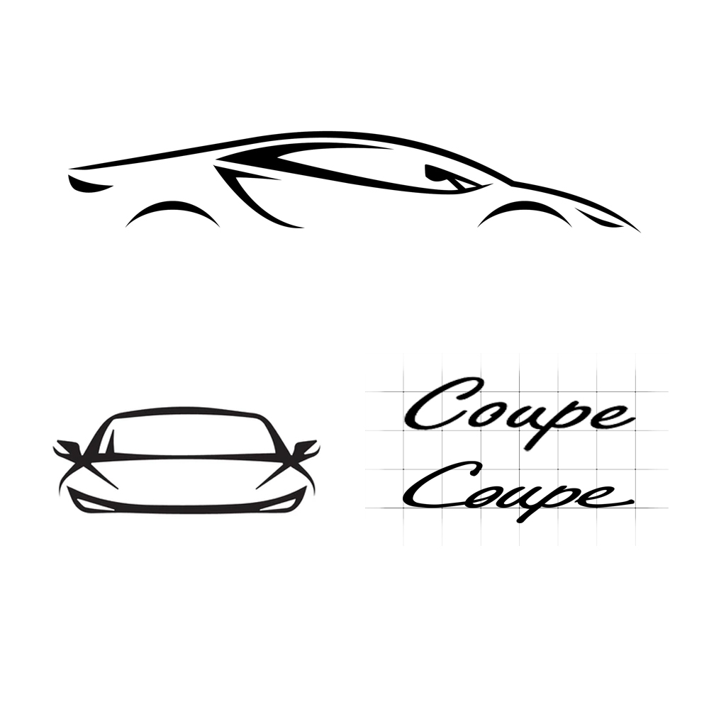
Typography
The chosen typeface is a custom script with flowing, cursive lines, emphasizing sophistication and individuality. The smooth curves mirror the elegant lines of a car's exterior, suggesting both motion and refinement.
Color Palette
The primary color used is black, symbolizing luxury, power, and timelessness. Black also ensures the logo remains versatile against any background or application.
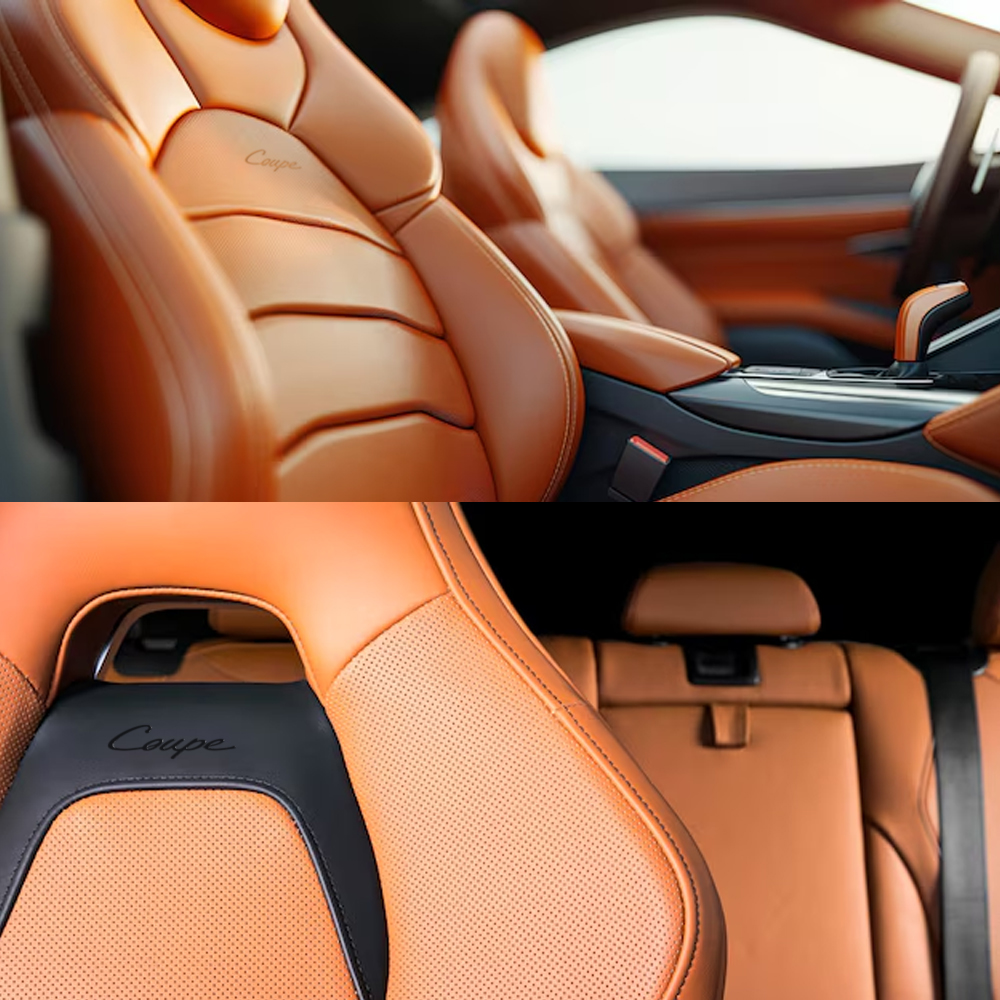
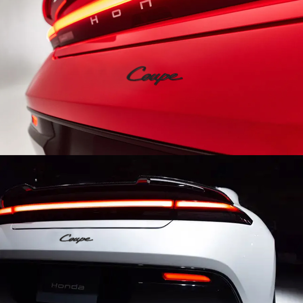
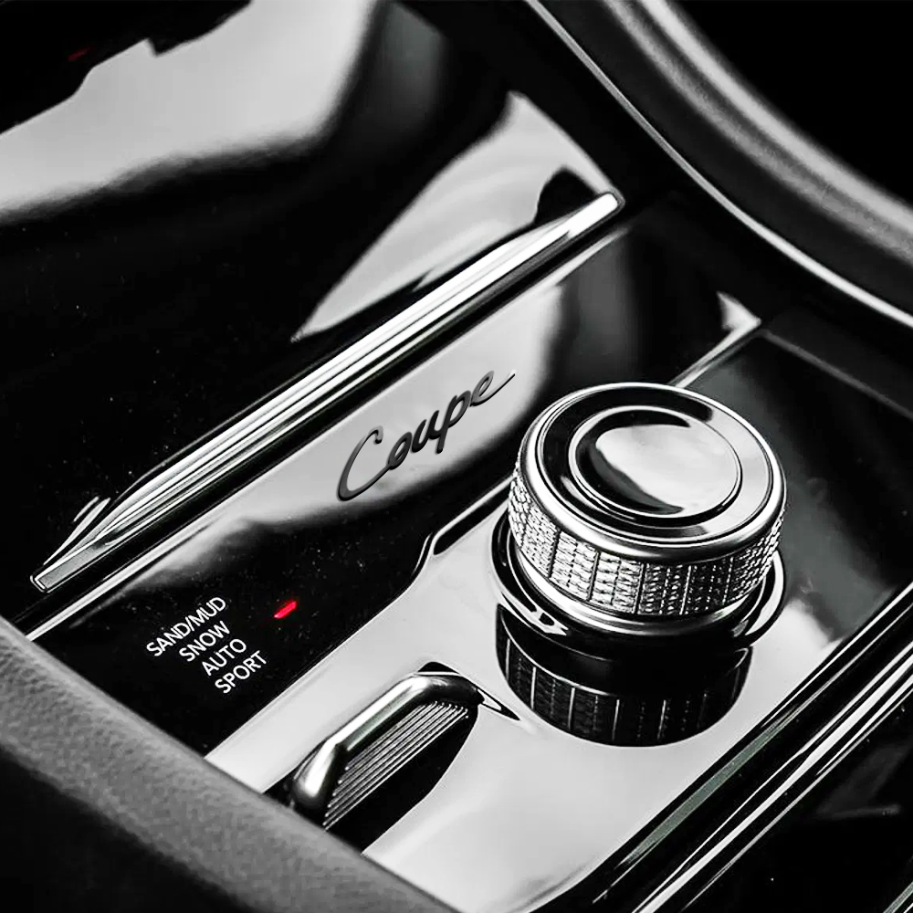
Application
Given the logo will be used across various outputs it was tested in multiple mediums such as digital, print, and automotive material fabrication.
These usage cases include:
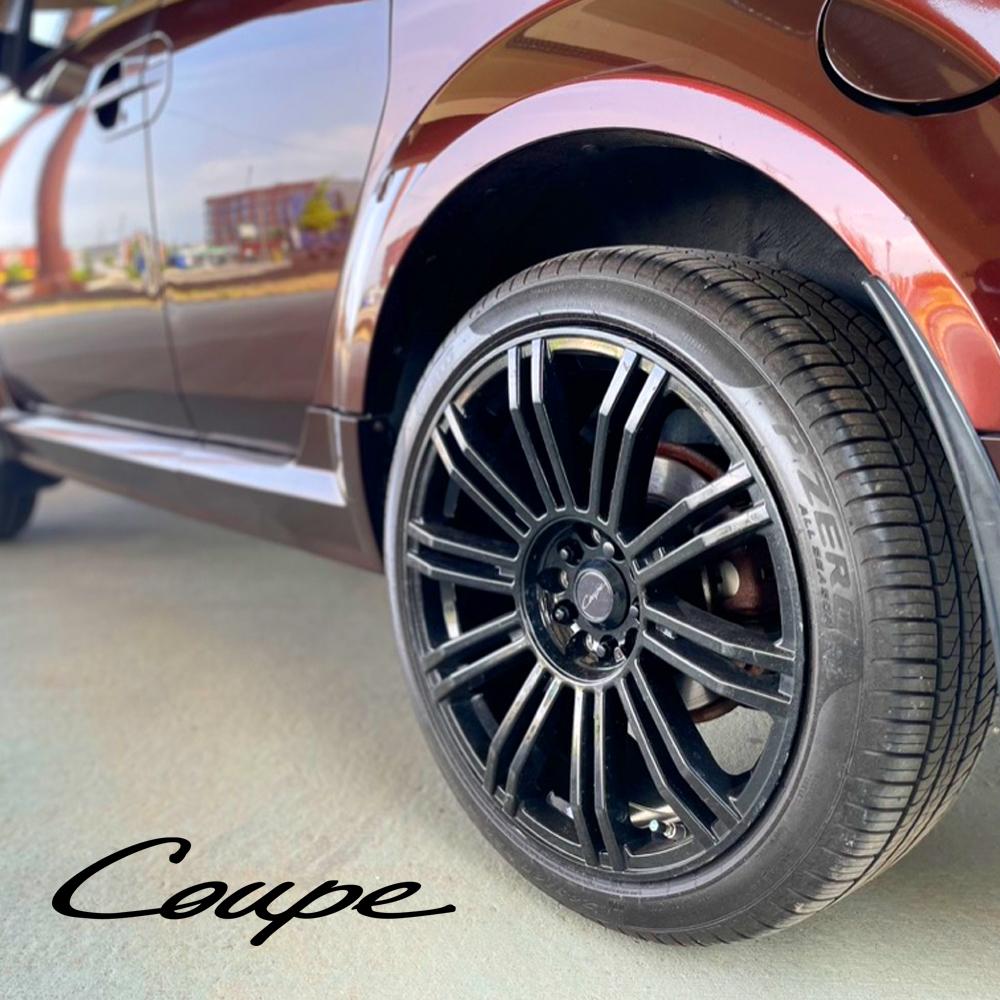
Vehicle Badges/Decals: Ensuring the logo maintains clarity and elegance when scaled for use on car exteriors.
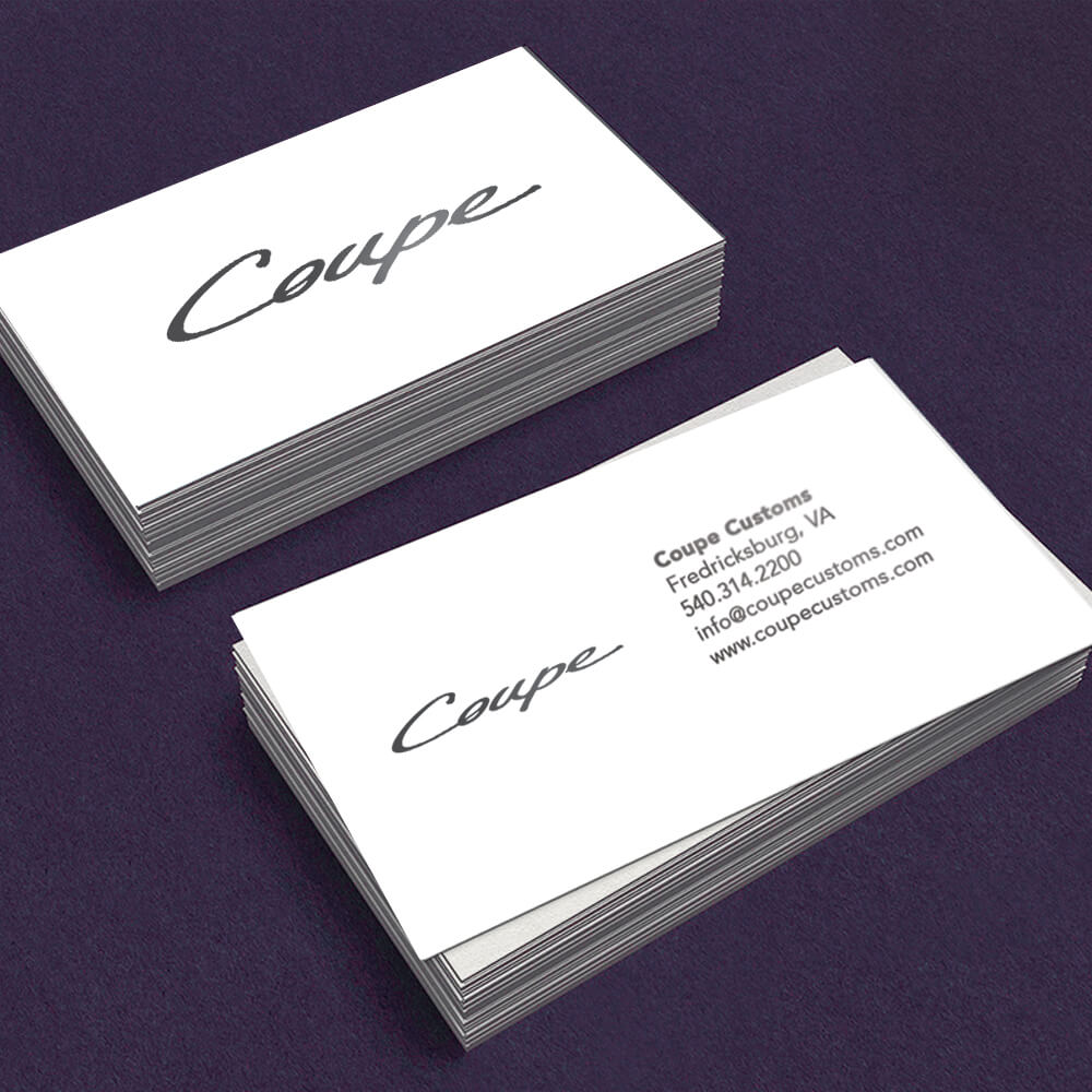
Business Cards: Maintaining readability and impact in smaller formats.
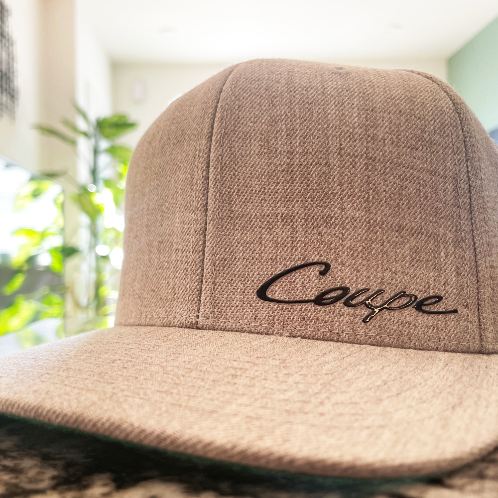
Merchandise: Adapting seamlessly to items like apparel, keychains, and other promotional materials.
Conclusion
The Coupe logo encapsulates the company's dedication to bespoke automotive design and user-focused innovation. By blending elegance, adaptability, and timeless design principles, the logo serves as a powerful visual representation of the brand's mission to enhance the driving experience.
More Client Case Studies