Kill Energy Drink
Kill is an energy drink that stands out in a saturated market by offering a natural, jitter-free solution to energy. Designed for high achievers—whether in athletics, work, or intellectual pursuits—the drink is formulated to boost cognitive performance and blood flow without relying on caffeine.
With a commitment to mental clarity, focus, and sustained energy, Kill promises to help you conquer your daily tasks, no matter how tough, and without the post-consumption crash that comes with most energy drinks.
Objective
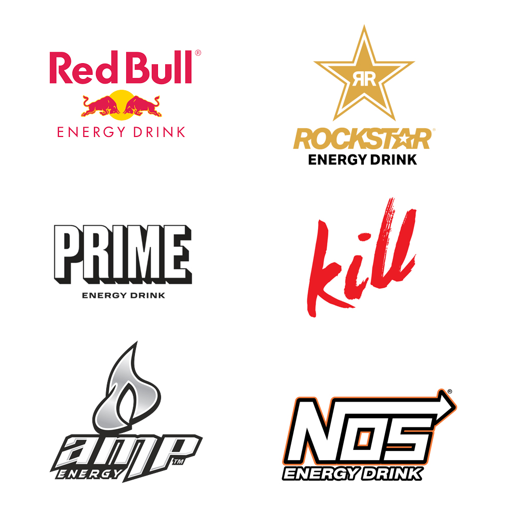
To establish Kill as a disruptive force in the competitive energy drink market, positioning it as the bold, unapologetically intense alternative to established brands like Monster and Red Bull. Kill will stand out by offering a unique combination of superior performance, extreme flavor profiles, and a strong, rebellious brand identity that appeals to thrill-seekers, gamers, athletes, and those who want more than just a caffeine boost.
Branding Goals
- Simple & Bold: The product design should convey confidence, clarity, and strength.
- Evocative & Edgy: The brand's visual language needs to evoke the idea of decisiveness and focus—no frills, no distractions.
- Modern & Minimalist: The branding should resonate with a modern audience that values efficiency and sleek yet raw, sophisticated aesthetics.
- Memorable: The logo and design should be instantly recognizable, drawing attention in a competitive energy drink market.
Concept
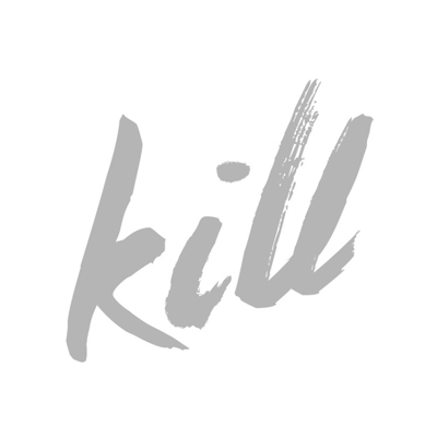
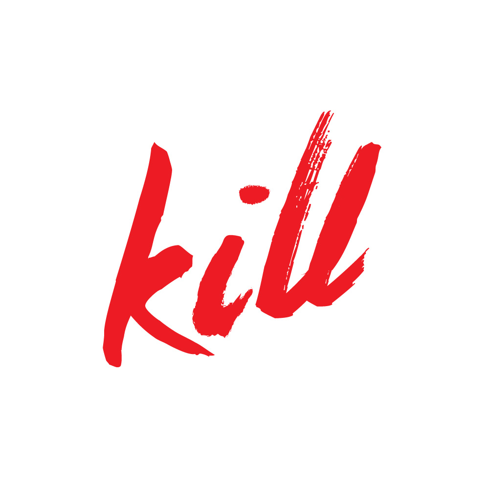
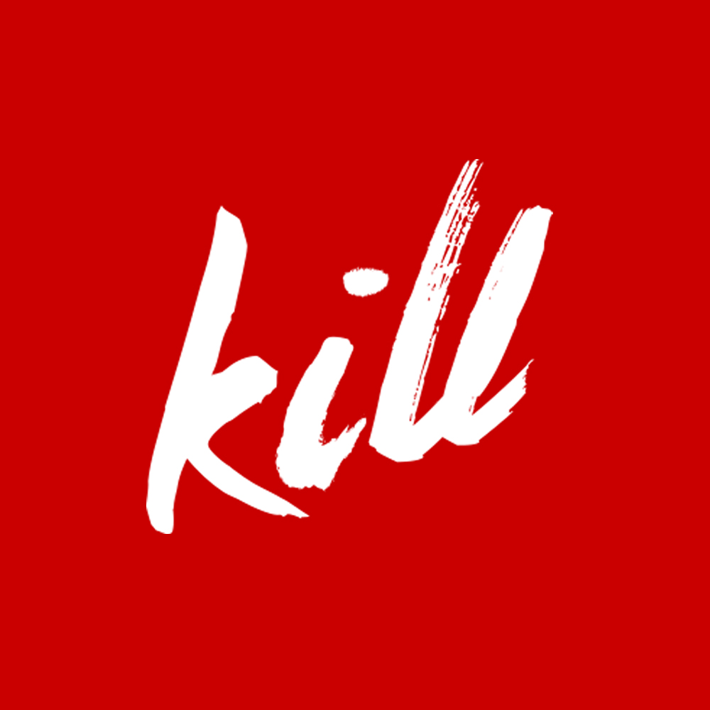
- The logo for Kill needs to be stark, bold, and memorable—communicating both intensity and clarity. Given the product's theme, the logo will leverage the concept of "written in blood," reflecting the serious commitment needed to tackle life's challenges.
Typography
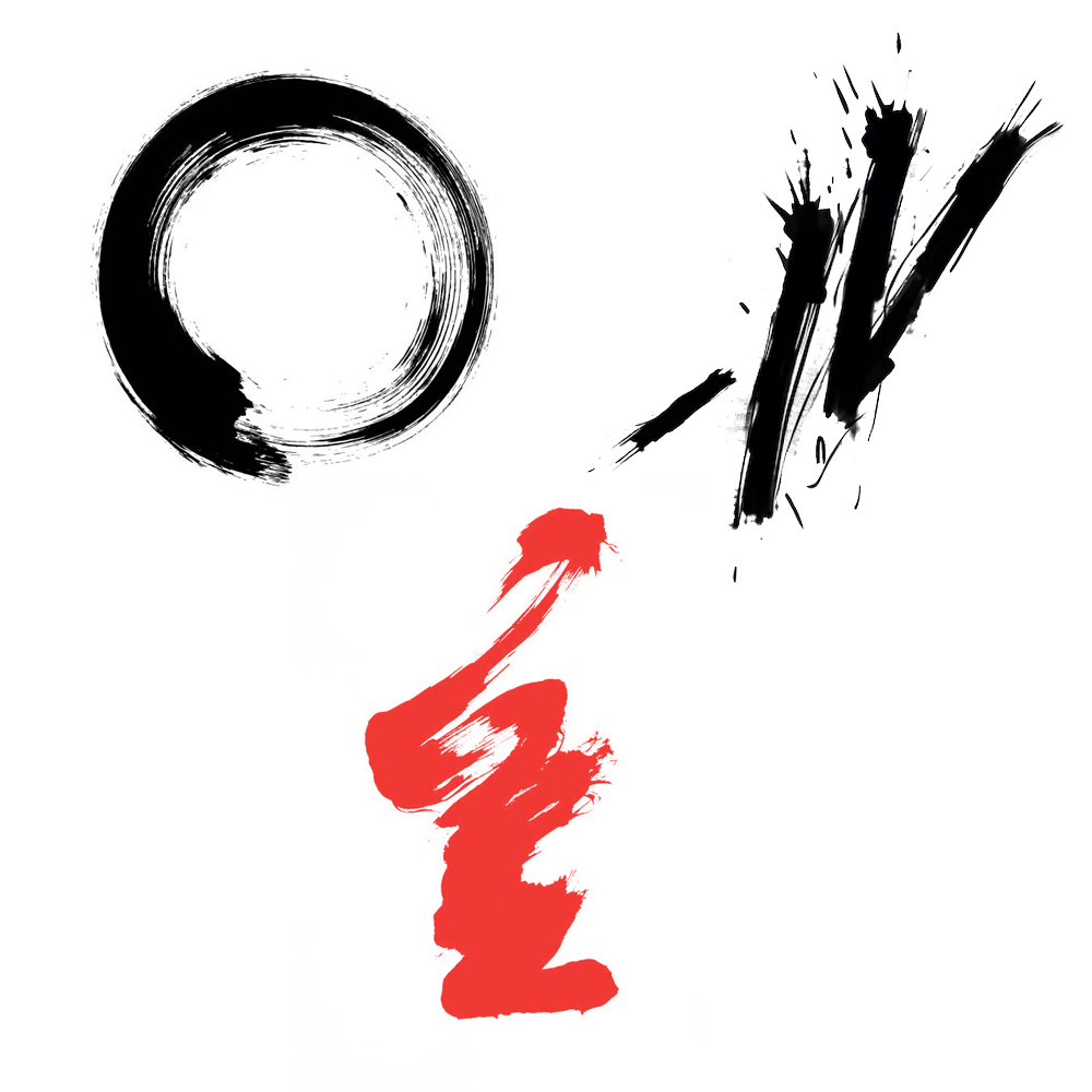
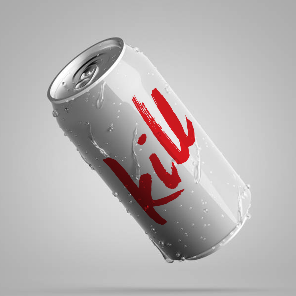
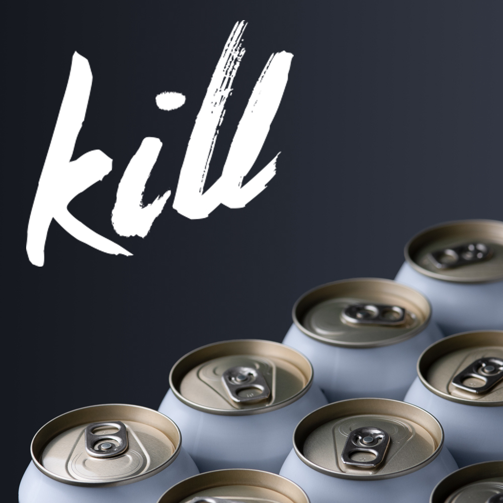
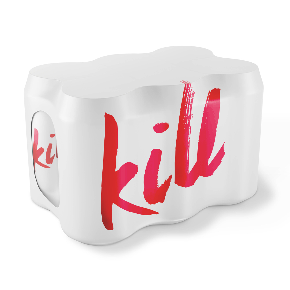
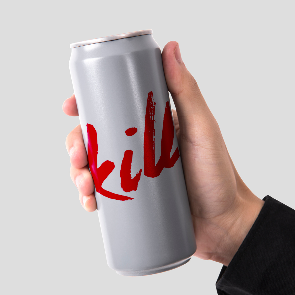
The logo will use a hand-drawn, distressed lettering that resembles blood being written or dripping, emphasizing the boldness and raw energy behind the name. The japanese calligraphy inspired style provides a clean and intentional approach, all while evoking a rebellious feel, suggesting the brand willingness to push boundaries.
Color Palette
- Bright Red: Representing blood, passion, and energy—suggests urgency and vitality
- Black & White: Adding contrast and clarity to the overall design
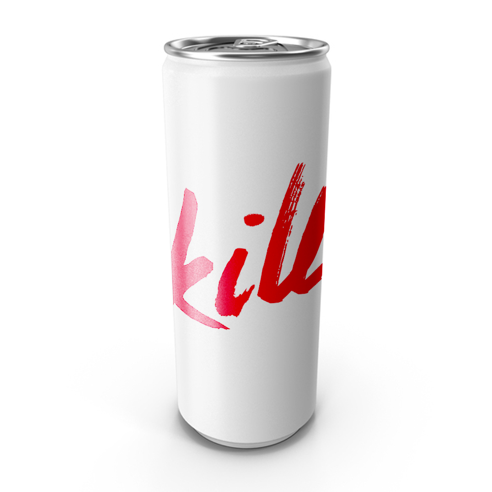
Product Packaging Design
The packaging will feature bold, large typography on a stark white background, with the name Kill in the blood-evoking font. A minimalistic approach to the design will emphasize strength and focus, avoiding busy patterns or unnecessary distractions.
Ingredient Transparency: On the side of the can, clear and bold icons or text can showcase key ingredients like natural nootropics, ginseng, or beetroot (for blood flow), providing transparency and supporting the brand's promise of clean energy.
Size and Shape: The packaging uses a tall, sleek, modern can design (330ml or 500ml) with sharp lines and minimal curves, aligning with the brand's focus on efficiency and strength.
Conclusion
The branding for Kill is designed to embody strength, focus, and uncompromising performance. From the "written in blood" logo that speaks to dedication and drive, to the minimalist packaging and bold typography, every design element conveys a commitment to excellence. Kill is for those who aim to take on their day with relentless focus and energy, with a clean, natural boost that supports both the mind and body.
More Client Case Studies