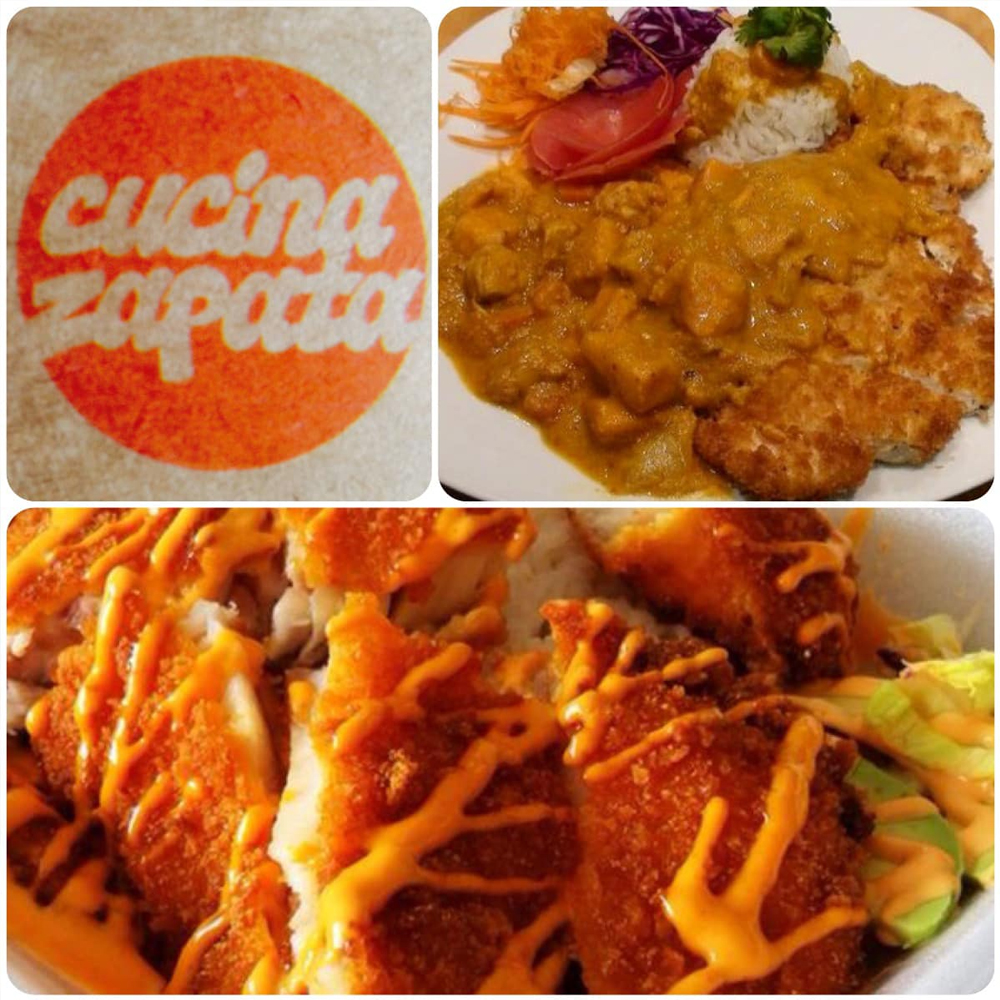
Cucina Zapata
www.facebook.com/cucina.zapataCucina Zapata is a food truck specializing in Asian-Mexican fusion cuisine. Their menu offers a unique blend of bold and exciting flavors with a modern take on comfort food. They needed a brand identity that would capture the vibrancy, creativity, and cultural diversity of their dishes while appealing to a wide range of customers.
Objective
To create a logo and branding system that reflects Cucina Zapata's fusion of Asian and Mexican culinary traditions, modern comfort foods, and their energetic street-food vibe.
Discovery Phase
During the initial discovery phase, we identified the core values of Cucina Zapata:
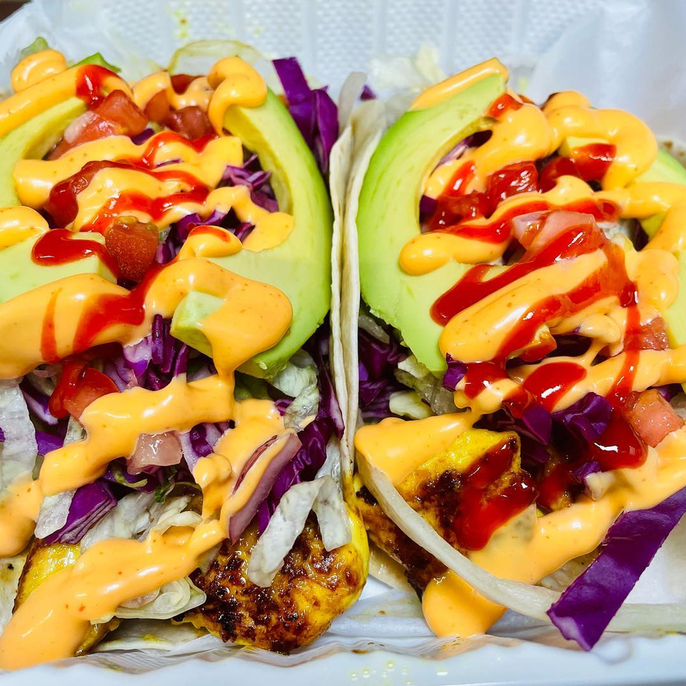
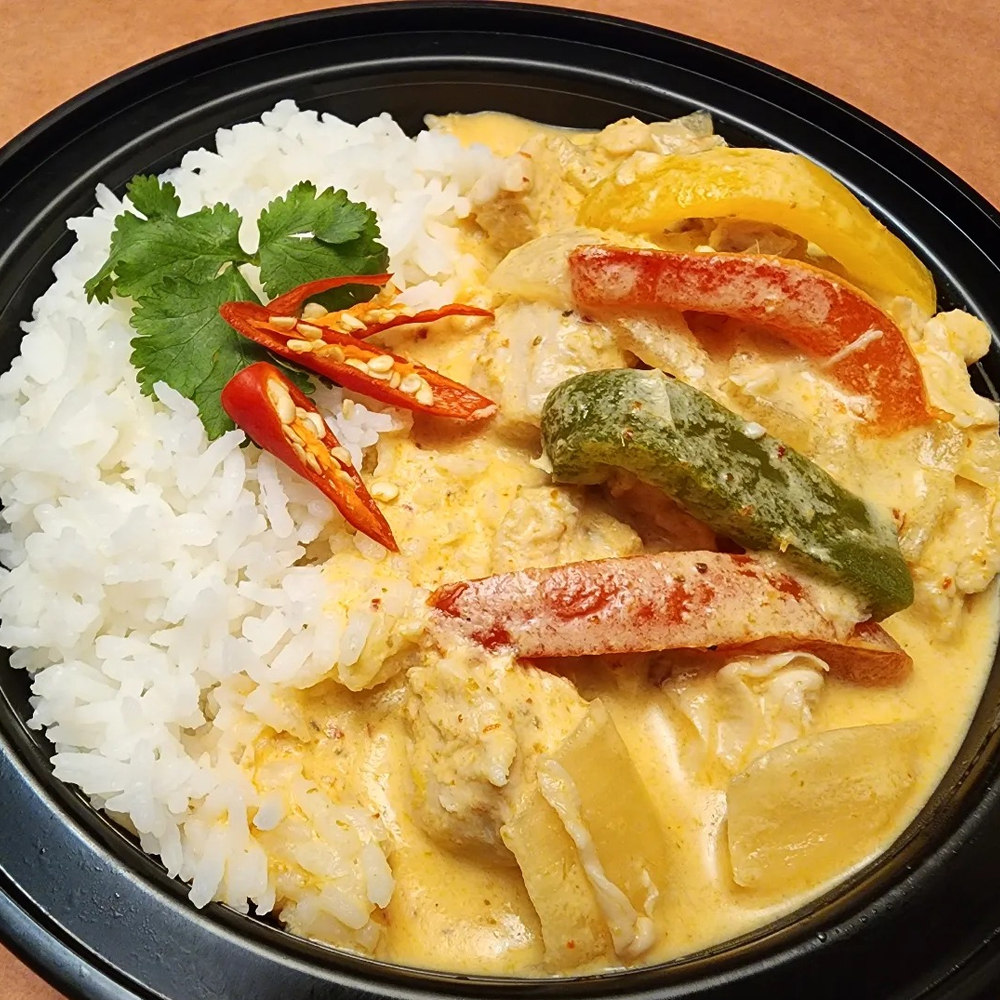
- Bold flavors: Spicy, savory, and flavorful dishes from two distinct culinary cultures.
- Cultural fusion: An equal blend of Asian and Mexican influences.
- Comfort food with a twist: Familiar dishes reimagined with exciting new combinations.
- Modern street food: Fun, casual, and approachable.
Design Challenges
- How to visually merge the aesthetics of two very distinct cultures.
- Designing for a street food truck where the logo needs to stand out on the go and be easy to recognize from afar.
- Maintaining a balance between modern, fun, and approachable while representing a simplistic and recognizable brand.
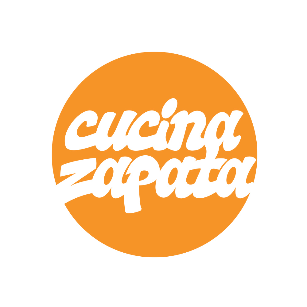
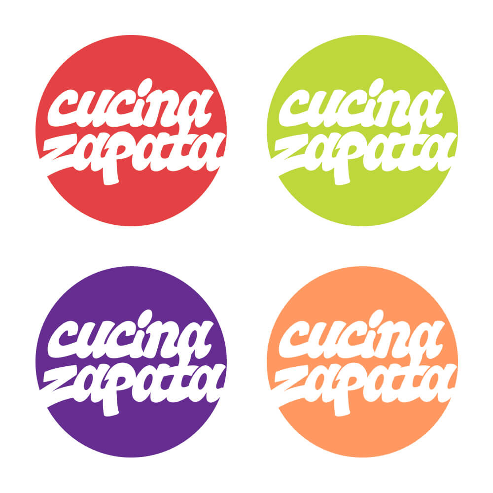
Color Palette
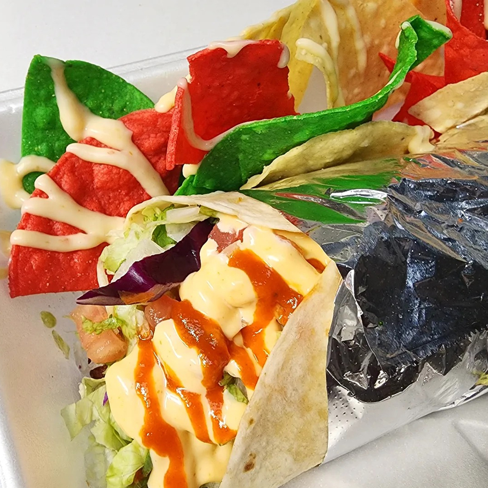
- Warm reds and oranges represent the spiciness and warmth of the food, connecting with both Mexican and Asian cultures.
- Bold green evokes freshness, vitality, and street market vibrancy.
- Deep purple adds contrast and conveys a sense of modernity and cool tones, balancing the warm colors.
The color selections mimic the aesthetics of the dishes themselves. Clean text using the negative space within a simple circle and color variations playfully represents some of the actual food ingredients such as chilies, avocados, red cabbage, thai tea and Cucina Zapata's renowned sriracha mayo.
Branding Elements
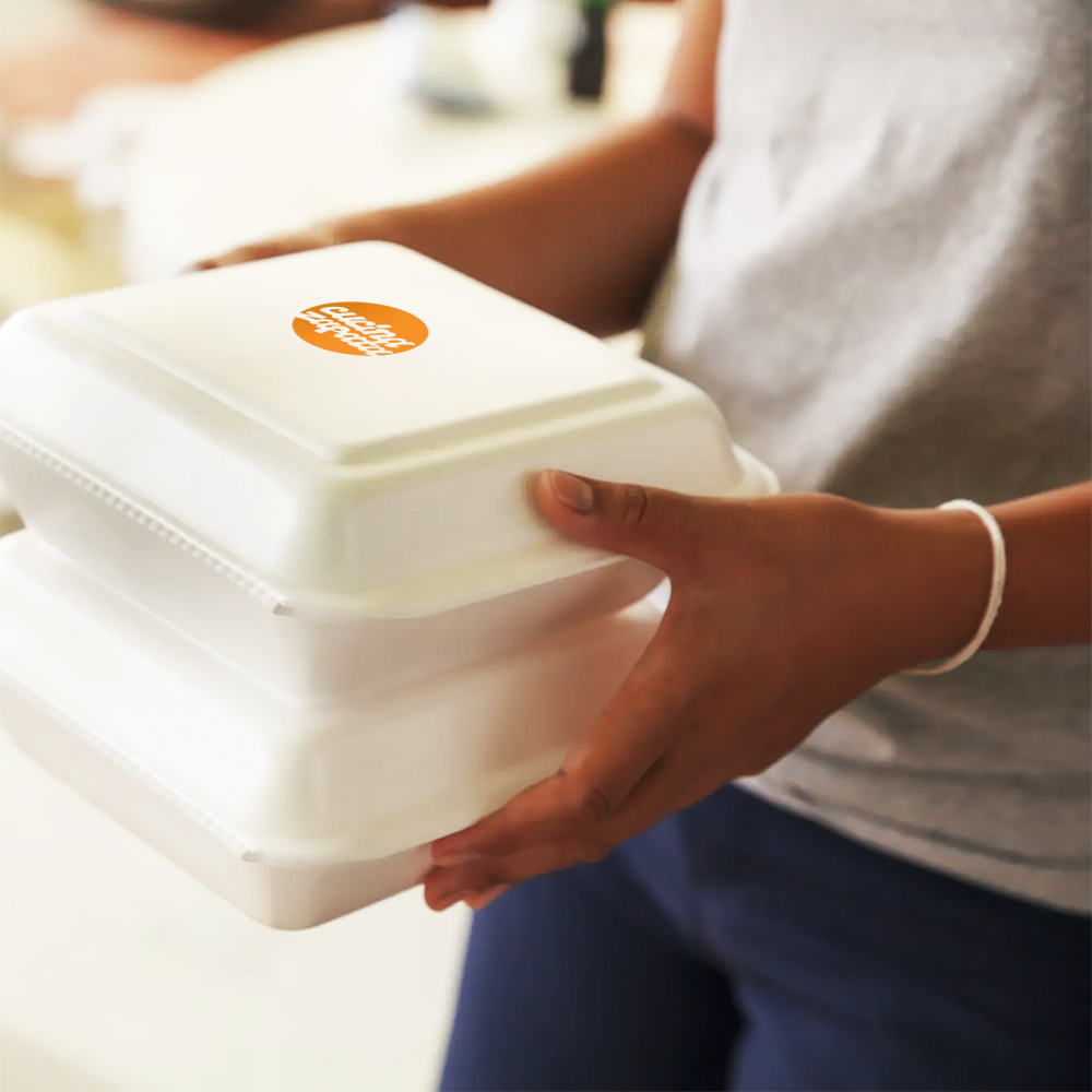
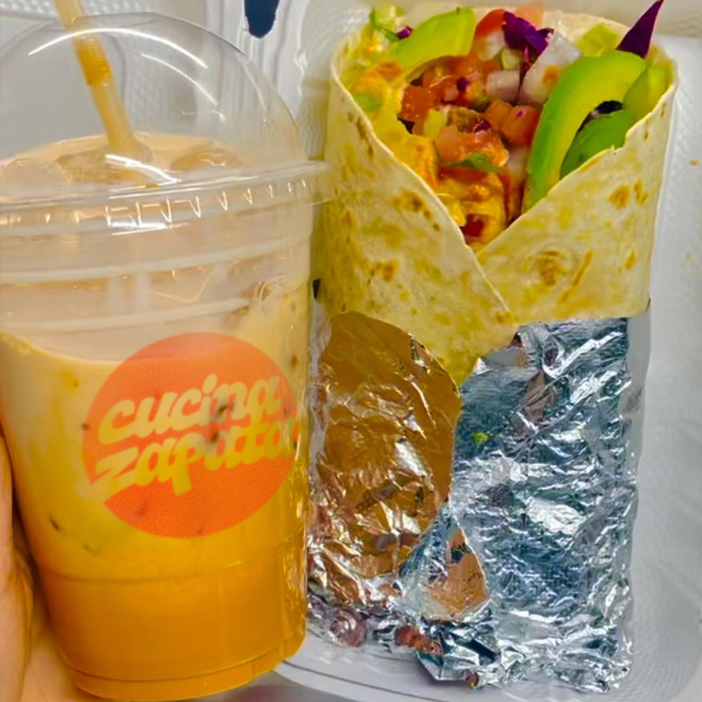
Packaging: Packaging includes branded paper wraps, eco-friendly containers, and stickers featuring the logo and color palette.
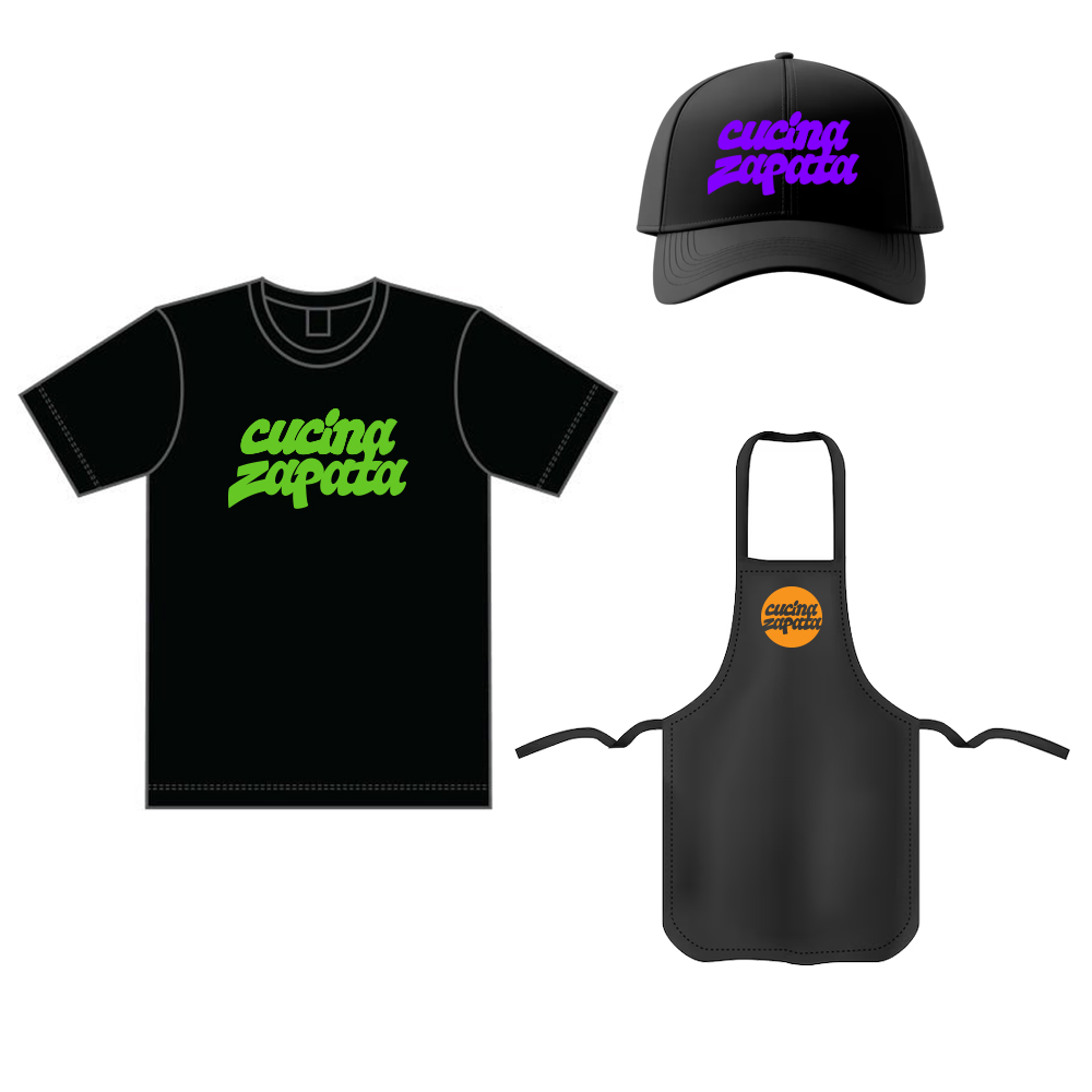
Merchandise: T-shirts and hats for staff feature the logo on the front, while food bags, containers and beverage cups use the simplified logo to help boost brand recognition and distinction.
Outcome
Cucina Zapata's branding successfully captures the fusion of Mexican and Asian cuisines, creating a strong yet fun visual identity. The truck's vibrant design attracts customers on the street, while the cohesive packaging and menu design enhance the overall customer experience. The fusion concept is visually clear, helping customers immediately understand what the food truck offers, while the modern street-food vibe appeals to a diverse audience.
Client Feedback: Cucina Zapata has shown strong social media engagement since it's inception with customers sharing photos of the food truck, packaging, and merchandise. The clean & simple yet distinct identity helped them stand out in a crowded food truck scene with sales nearly 30% better than it's local competitors.

Conclusion
This campaign allowed for a blend of cultural sensitivity, creativity, and modern design elements that helped Cucina Zapata establish itself as a legitimate player in the emerging Philadelphia food truck scene. The brand's playful, vibrant, and dynamic personality reflects both the food and the experience customers have at the Drexel University campus food truck.
More Client Case Studies