Spinnaker Search Group LLC.
www.spinnakersearch.comSpinnaker Search Group is a recruiting agency committed to redefining the professional search industry. The company positions itself as a true recruiting partner, focusing on building long-term, trusted relationships with both clients and candidates. Their mission is to deliver highly evaluated and thoroughly vetted talent while minimizing risk for clients. By investing time to carefully assess every candidate and their fit within a client's organizational culture, Spinnaker aims to offer a more personal, transparent, and effective recruiting experience.
Branding Objectives
- Professionalism: Convey trust, expertise, and reliability.
- Innovative Approach: Highlight the modern, refined way the agency handles search.
- Memorable & Scalable: A logo that can grow with the company as it expands and scales.
- Human-Centric: Reflect the agency’s focus on building strong relationships.


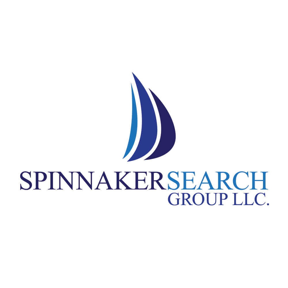
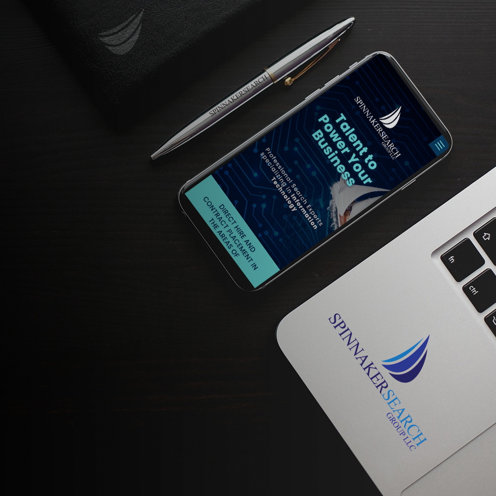
Design Inspiration
The inspiration for the logo comes from the spinnaker sail—a sail that catches the wind to propel a boat forward. This symbol serves as a metaphor for how Spinnaker Search Group helps its clients move forward by finding the right talent and driving growth. A spinnaker sail also represents the idea of guiding organizations toward new opportunities, much like how the agency guides clients to the best candidates.
Logo Elements
- Spinnaker Sail Symbol: A modern and sleek stylized sail in the logo represents the guidance and direction Spinnaker offers to its clients. The sail’s movement can also suggest momentum, growth, and success. Key elements of the recruiting process.
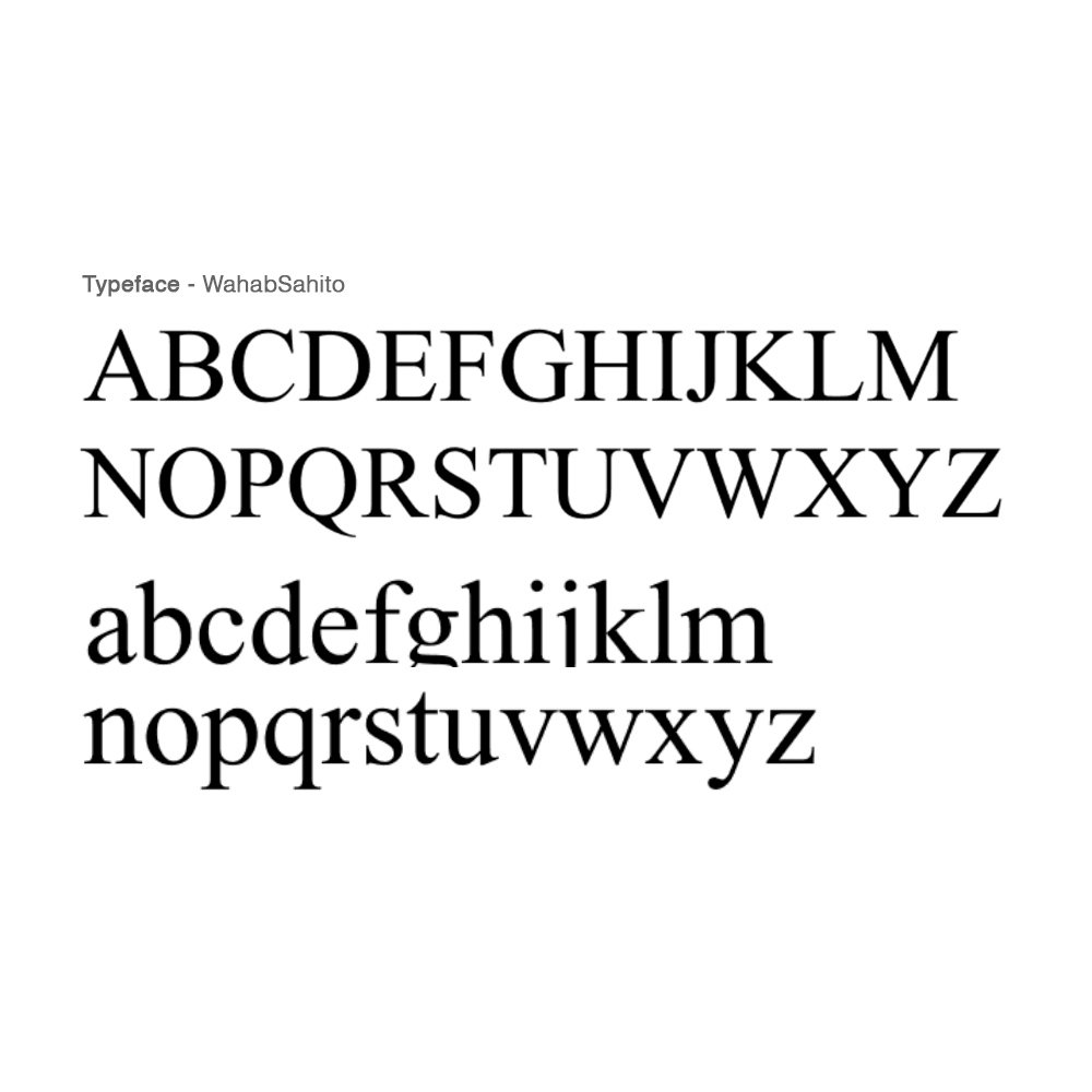
- Typography: The typeface is modern, professional, and legible, with a balance between serif and sans-serif styles to convey both tradition (reliability) and modernity (innovation). The use of clean, geometric fonts would give the logo a timeless quality while maintaining sophistication.
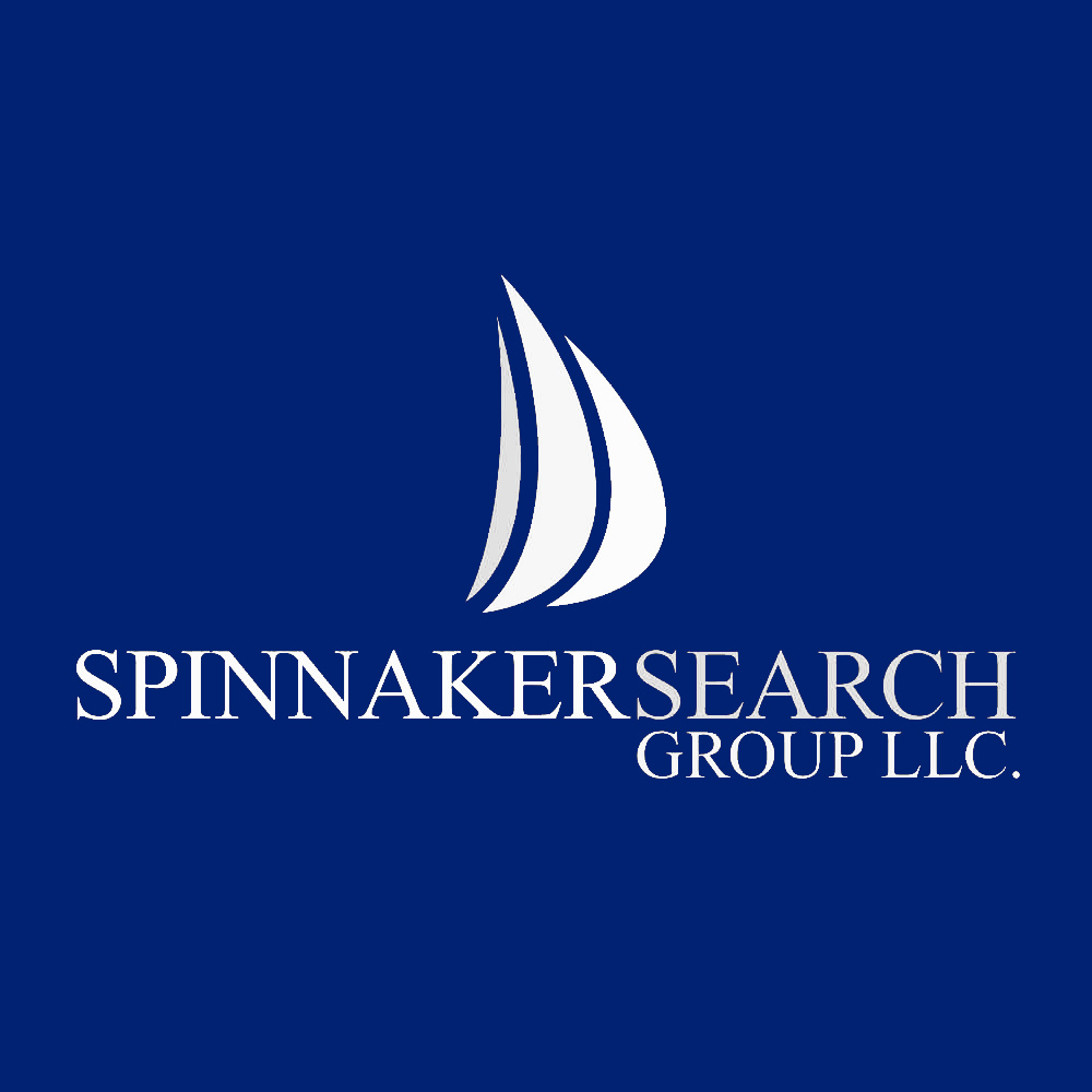
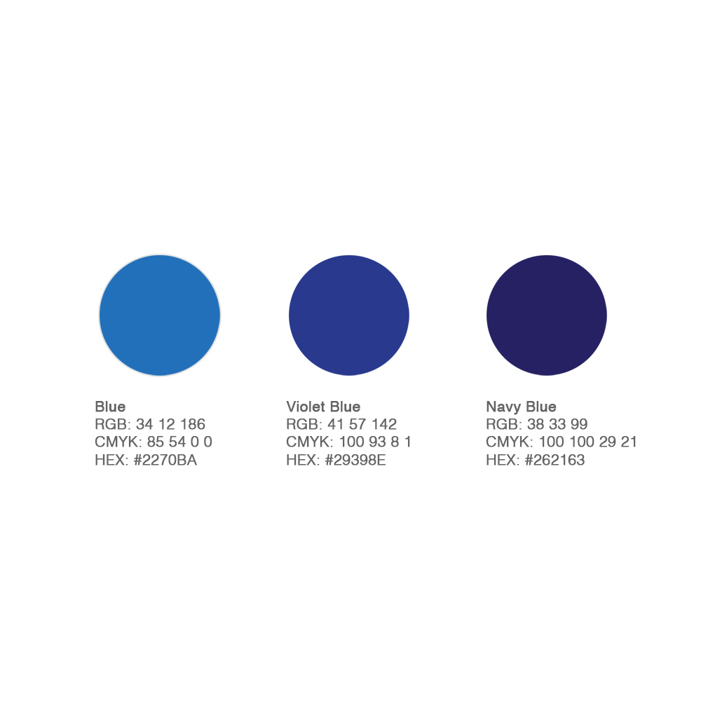
- Color Palette: With blue generally representing trust, professionalism, and authority, the 3 variants of blues can symbolizes growth, renewal, and balance, aligning with the idea of helping clients and candidates thrive
Branding Voice
The brand voice for Spinnaker Search Group should be:
Authoritative, yet approachable: It should convey expertise, but also be warm and welcoming, reinforcing the company’s commitment to long-term relationships.
Clear and Transparent: The language should be straightforward, emphasizing the company’s commitment to honesty and clear communication.
Positive and Confident: Emphasizing solutions, forward motion, and success without being overly aggressive. The brand should inspire trust and confidence at every step of the recruiting process.
Conclusion
The branding and logo design for Spinnaker Search Group captures the essence of the company’s mission to redefine recruitment by fostering genuine partnerships, navigating complex talent landscapes, and exceeding expectations at every turn. Through a modern, sleek logo inspired by the spinnaker sail and a thoughtful brand identity, Spinnaker’s visual presence will reinforce its reputation as a trusted, authoritative, and innovative partner in professional recruitment.
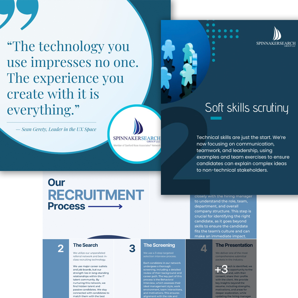
More Client Case Studies